
Failure Mode and Effects Analysis
Fizzle
Surface high‑risk assets faster, consolidate evidence, enable safe previews, and make approvals auditable
Timeline
6 Months
Role
Lead UX — research, interaction design, prototyping, validation, handoff for the end‑to‑end FMEA experience.
Tools
Balsamiq
Figma
After effects
My Impact
Turn fragmented risk records into actionable clarity — measured in faster detection, higher completeness, and reduced unresolved risks. This positions as a driver of measurable system resilience.



Context
Most FMEA tools today rely on static tables and complex workflows, making risk management feel heavy and disconnected.
Even modern platforms struggle to deliver clarity, collaboration, and intuitive visualization for teams handling reliability gaps.
Most FMEA tools rely on static tables, making risk management a disconnected chore.
I led the UX to transform these dense reliability workflows into an interactive, flow-based canvas that drives measurable system resilience.
What We’re Solving
Users aren’t asking for more features
— they’re asking for clarity, speed, and control. Here’s what they’ve told us:
Spreadsheet Fatigue
Bury risks in static tables, making them hard to read, update, and act upon
Overemphasis on Numbers (RPN)
Focus only on risk scores, ignoring context and severity of failures
Outdated Documentation
Rarely updated after design changes, leaving them stale and unreliable
Collaboration Gaps
Risk analysis often happens in silos, with poor cross-functional input and unclear ownership
High Cognitive Load
Dense forms and inconsistent methodologies overwhelm users, reducing adoption
Highlights
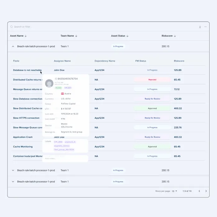
One Dashboard, Infinite Clarity
Customizable dropdown system that lets users instantly view Fizzle’s status or asset information. This reduces navigation friction and empowers confident decision‑making.
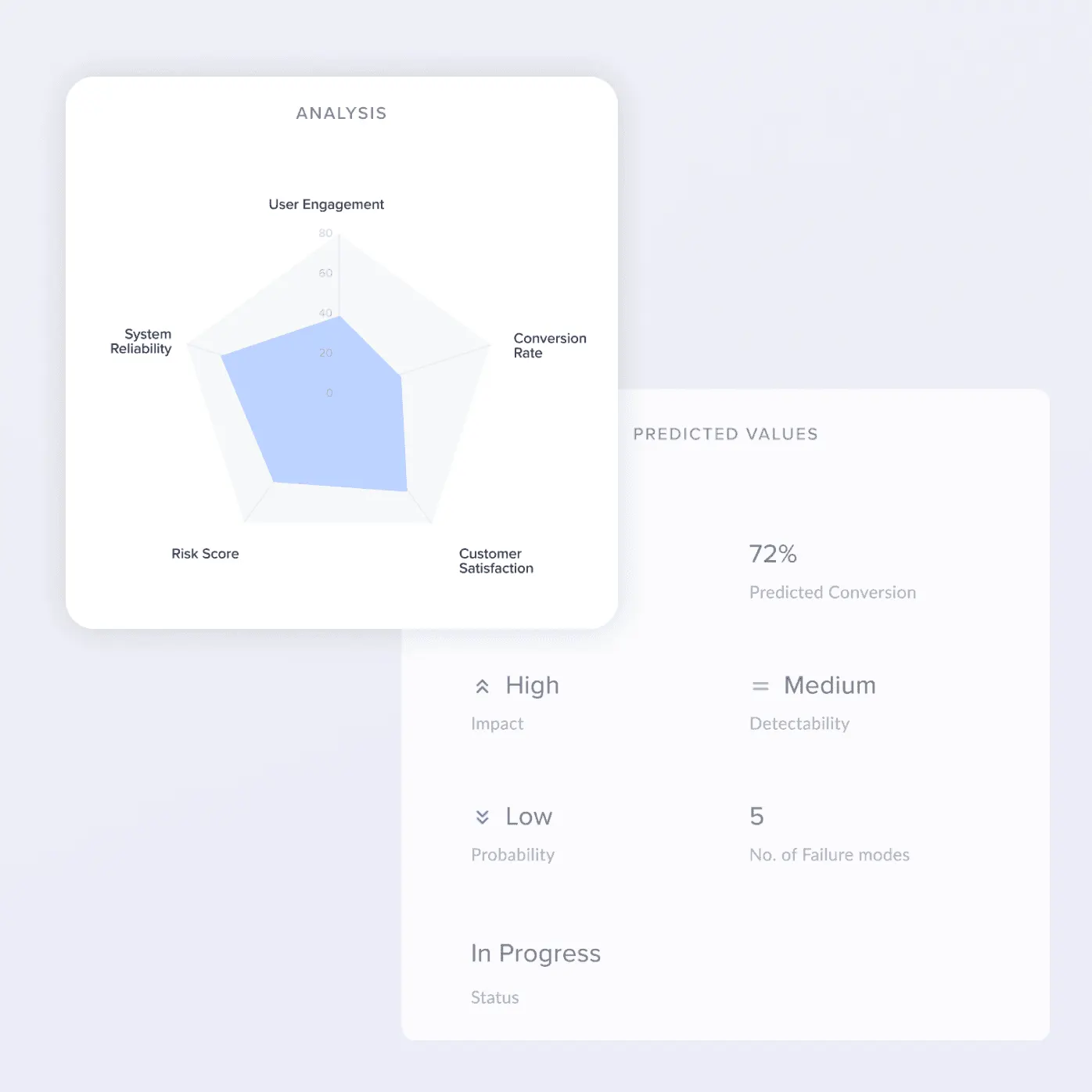
Stay Ahead with Real‑Time Risk
Dynamically updates active failure modes, reliability gaps, and risk scores. This ensures users always act on the freshest data, turning monitoring into proactive management.
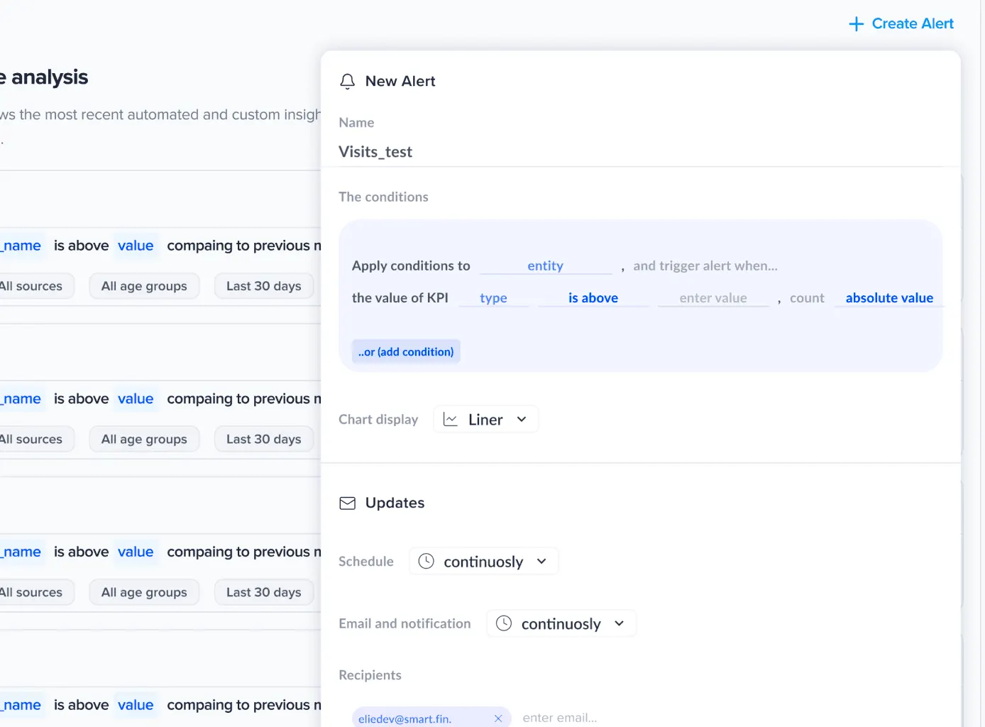
Alerts That Work Your Way
Own alerting workflows and archive outputs seamlessly. This flexibility transforms alerts from generic notifications into tailored signals that drive accountability.
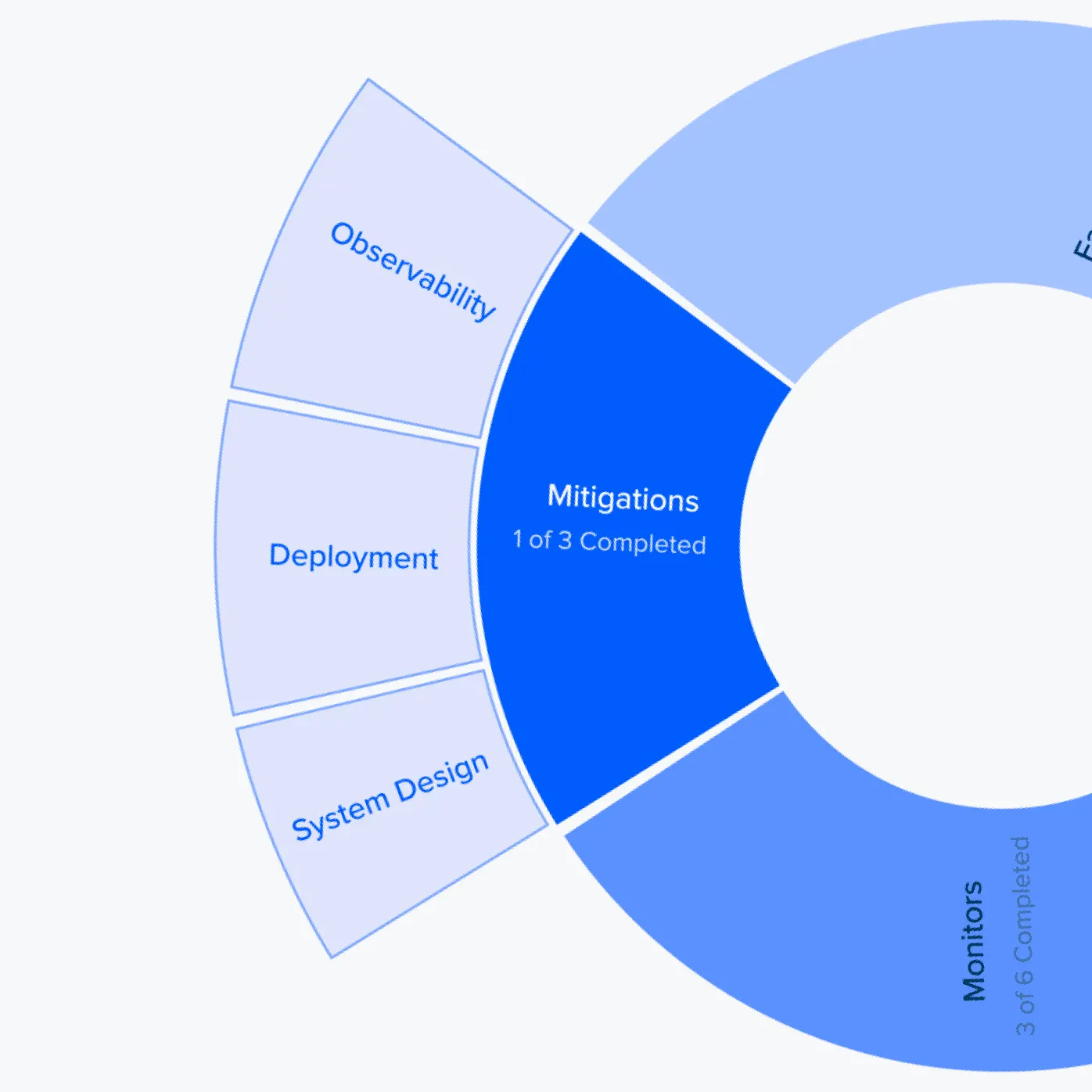
Risk Made Visual, Interaction Made Seamless
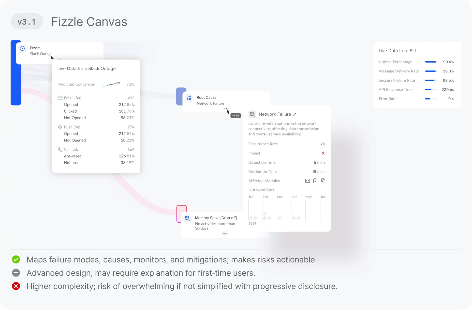
The canvas enables drag‑and‑drop interaction with models, making complex FMEA flows intuitive. It bridges technical detail with human‑centered design, fostering clarity and collaboration
Scroll for more detailed process
Insights
we found that FMEA tools weren’t failing because of missing features — they were failing users with complexity, silos, and stale data. Teams struggled to see risks clearly, collaborate effectively, and keep analyses current.
From static tables into a visual, collaborative flow, Fizzle gives teams clarity, speed, and control. As a UX designer, my impact was in reducing cognitive load, embedding habit‑forming design, and making reliability work engaging and actionable instead of a compliance chore.
50%
Complex Interface.
40%
Inadequate Onboarding.
35%
Limited Customization Option.

Reduce time‑to‑identify top risk from 3+ mins to
60sec
Lower incomplete risk records from 35–40% to
10%
Hours spent updating the Failure mode
06 Hrs/day
2:00
4:00
6:00
8:00
Manual tracking of Failure Mode updates creates delays. Mapping of the Entities and Failure Mode is very Complex

David Brown
Product Manager
Competitor Analysis
Google Sheets, ReliaSoft Xfmea, APIS IQ‑FMEA, Siemens, PTC PLM FMEA
Feature name/function
Flow Canvas
Inline Collaboration
Integrations (Jira/GitHub/ERP)
Snapshot Timeline
Progressive Disclosure
Custom Alerts
Problem and solution
Turning Challenges into streamlined solution
Layer
Systematic Workflows
AI Powered Engine
Simplify risk management with a visual flow canvas that cuts cognitive load and makes triage instant.
Collabration
Live Integration
Embed collaboration and live integrations so ownership is clear and records stay current.
Solution
Ideation
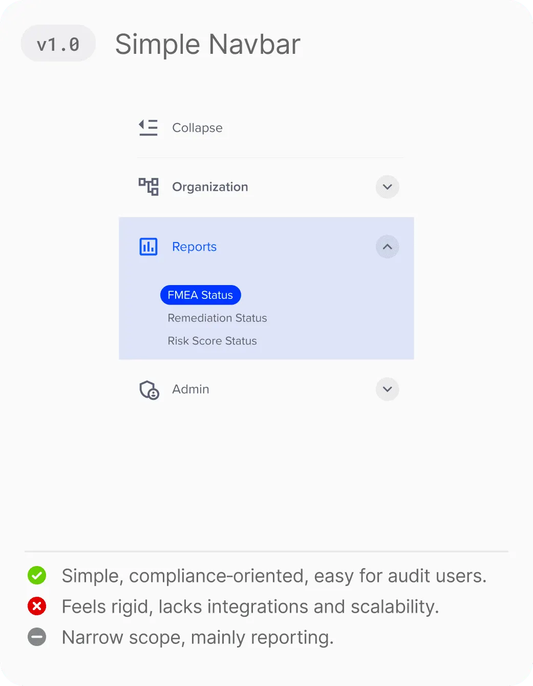
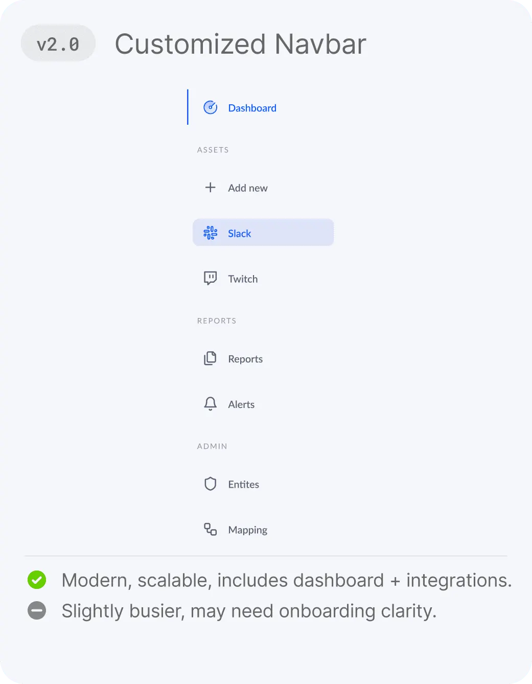
[Navbar]
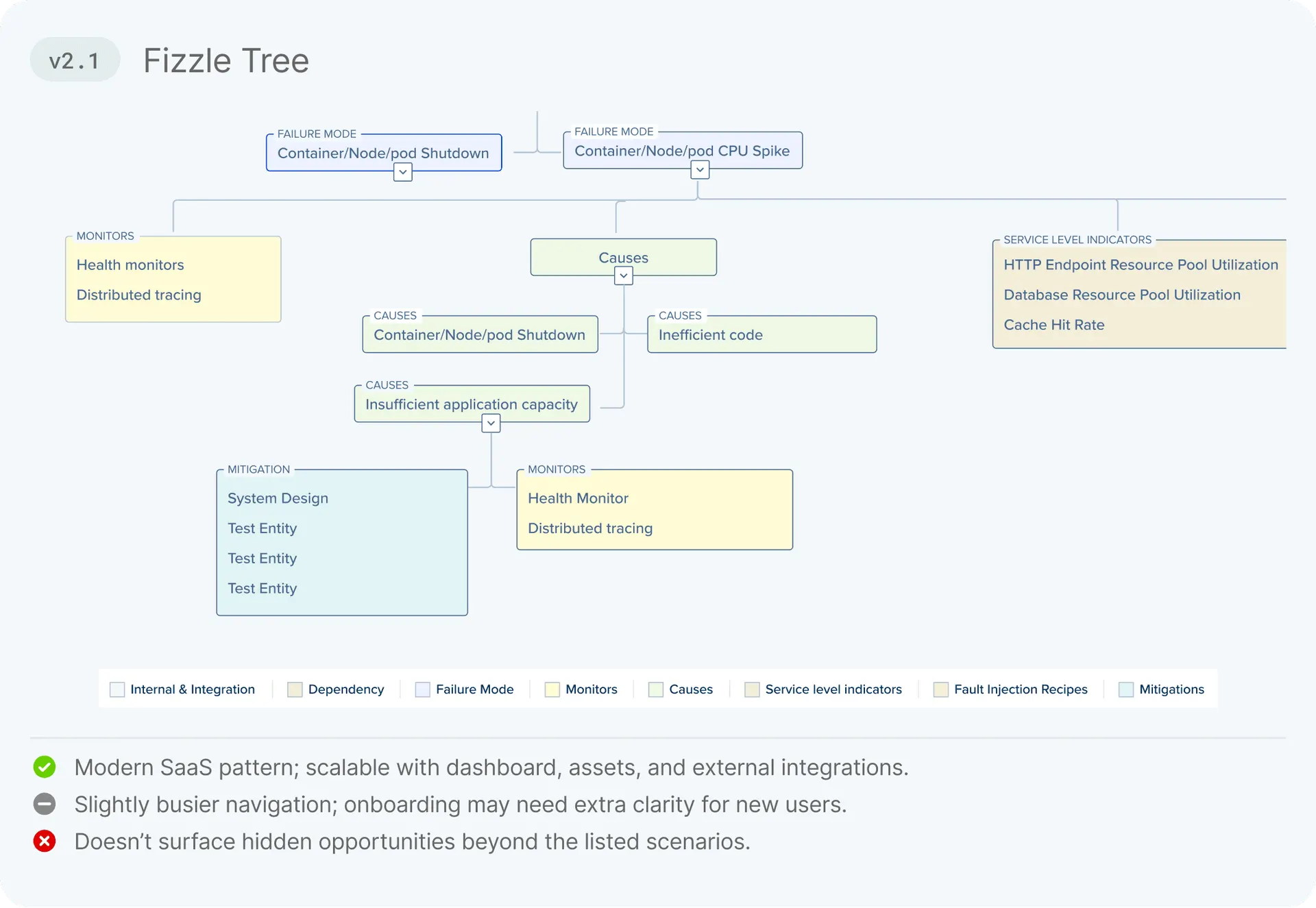
[Fizzle Flow]
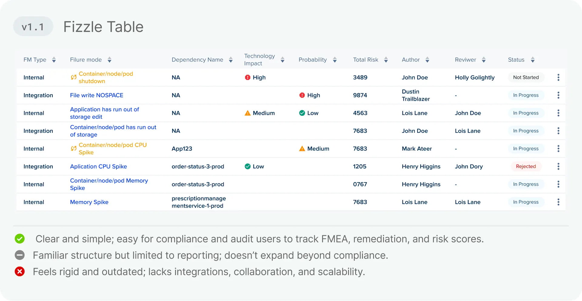
[Risk Score]
Final Design
Visualizing the Experience
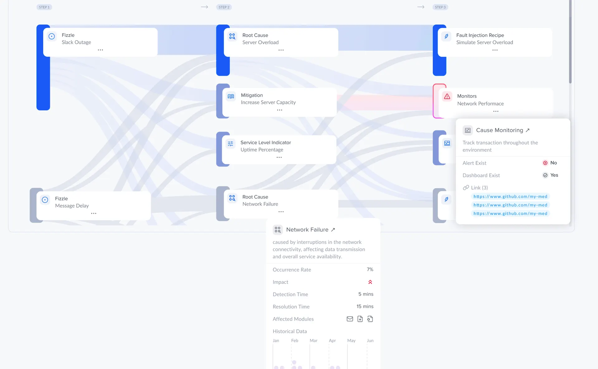
Moving from tabular data to a drag-and-drop canvas required strict alignment with the frontend team to maintain performance. I designed standardized component behaviors to ensure the canvas remained performant even when users mapped hundreds of failure modes simultaneously.
Learnings
Learned to design Fizzle for real‑time, integration‑first FMEA: surface data freshness, inline evidence, and pair scores with short narratives so teams can triage confidently.
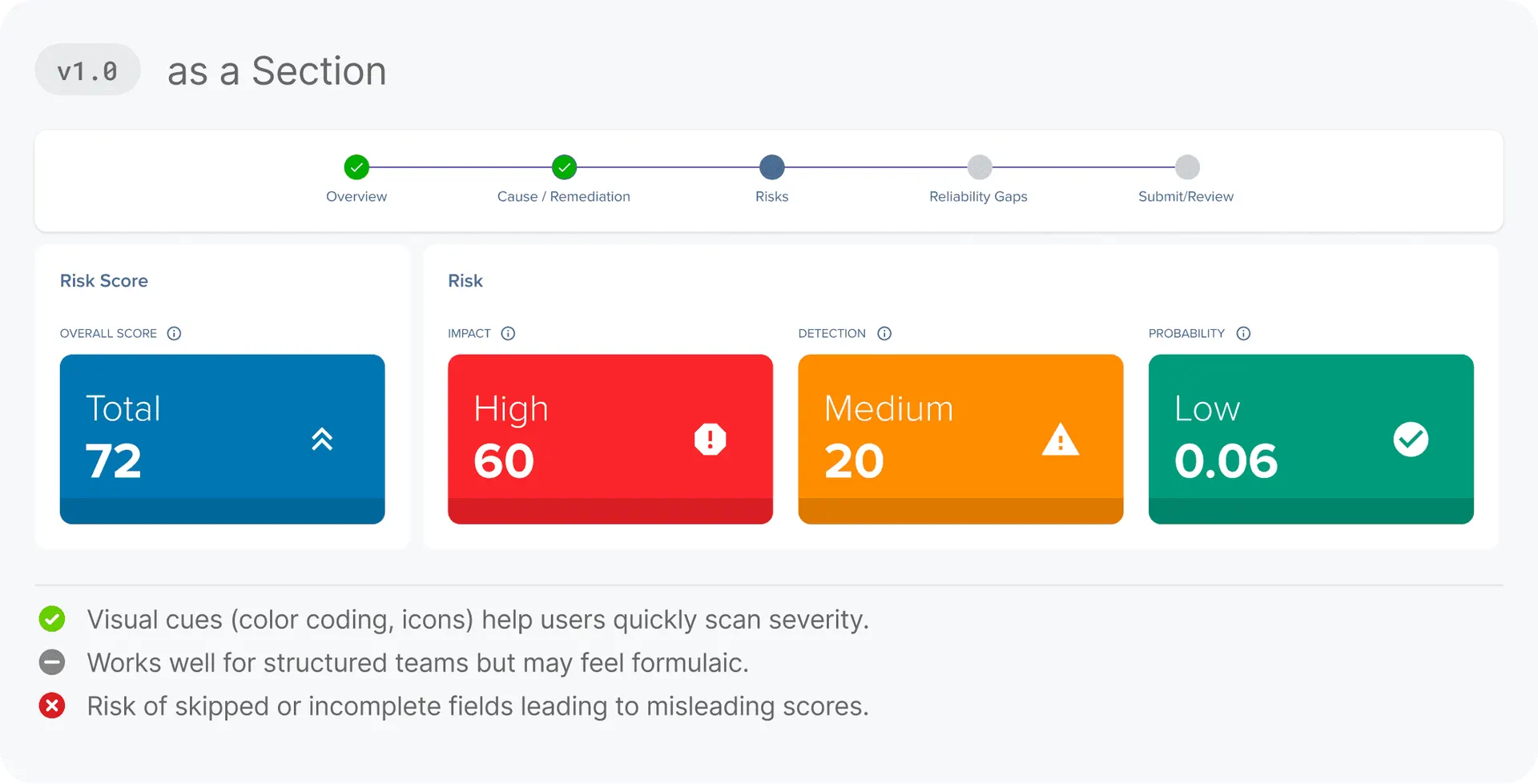
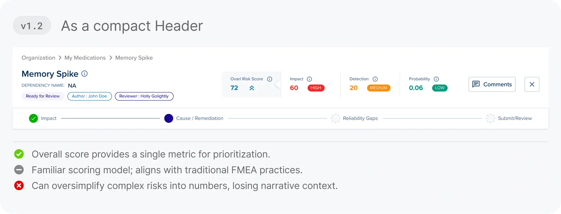
Score + story, always together
Numbers guide prioritization short narratives and root‑cause snippets make scores actionable and reduce rework during reviews.
Progressive automation, human in loop
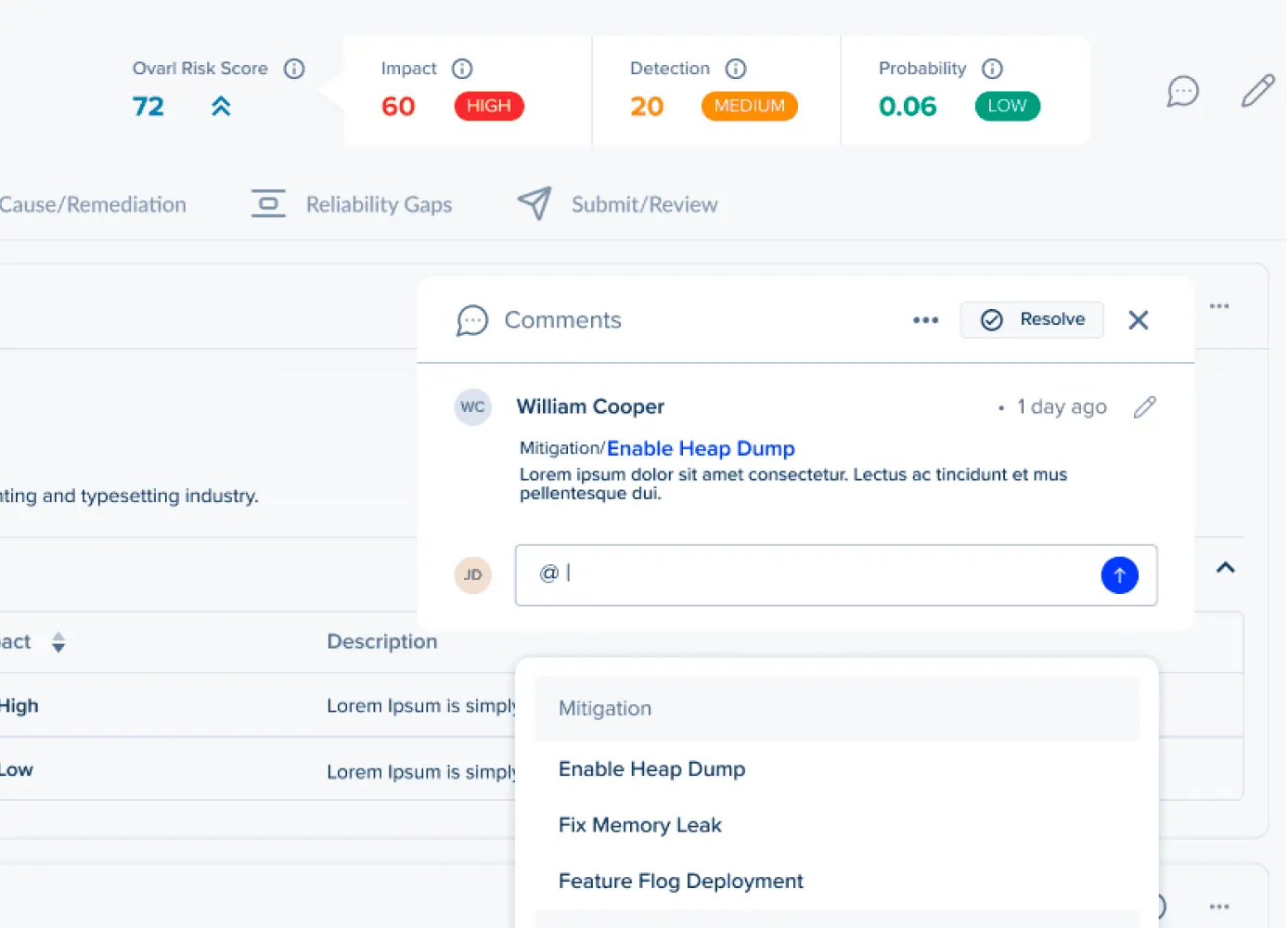
Auto‑populate and suggested mitigations speed work, but explicit owner review preserves accountability and trust.
Design for interruption and return
Users work across alerts and meetings — micro‑summaries, ownership badges, and quick‑ack flows keep momentum when they come back.
Measure adoption through outcomes
Track completeness, time‑to‑acknowledge, and risk‑closure velocity rather than feature clicks to prove Fizzle’s value.